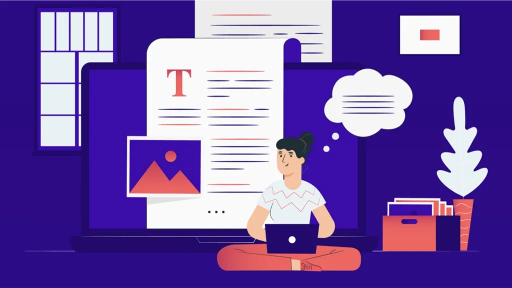
Look at the example of a cover I recently made for my new book.

Referring to this post, I just started to collect ideas of what can be done to support e-book cover design, with “e-book” being the most important part. We should stop thinking of e-books as a second class, second step or a second chance. We should stop thinking of CMYK, Pantone colors and the shade of a paper. Let’s think of a cover design for an e-book in terms of where it’s gonna be exposed. And it will not appear on a bookshelf. The destination of an e-book cover is a screenshelf.
As soon as we change our perspective, some amazing ideas start to crowd into mind. This single example of a cover, designed to be an e-book cover and nothing else, is benefiting from two possibilities, which are not so easy to be achieved with p-book covers:
Bright colors :. Every designer will admit, that it’s not easy to keep bright colors when it comes to printing. “An intensive green?–You need a Pantone color for that.” Now think – you don’t have this problem any more. Use the most of RGB scale, you’re not gonna loose it.
Transparency :. When you download a file to a place where an e-book will be shown, you can keep the transparency if you use a .png format. Transparency has a tremendous potential and it can start a totally new way of looking at book covers at all. I remember how impressed I was, when I downloaded Adrian Graham’s book to Stanza and it had round corners! So imagine a cover which is not limited, like in case of p-books, to what can be cut out of paper. Use just letters for a cover, make it round, take an impressive drawing and show it without a background, se a couple of layers, each one with a different transparency. And lots more.
The time is high to change attitude, as at least two major things are going to shape new expectations towards e-book covers:
:. It’s only a question of time when new color E-Ink devices will arrive
:. Apple will soon enter an e-book world with at least one eReading device – and totally change the way we think of e-books. The look is gonna be very important, as always with Apple, this time the look of an e-book.
Mike Cane wrote a great post, comparing p- and e- covers of the same book. I agree – e-books are eToilet. But it’s gonna change and the innovation will come from those, who treat e-books like a first class, first step and a first chance.
PS.
Soon I’ll write a more detailed post on the possibilities of an e-book cover design.


Leave a comment